Geovisualization for Analysis and Communication
According to the Board’s definition (1978), geovisualization is a unique geographic skill that requires a synoptic view of the distribution(s) represented on the map(s). It incorporates two key components of urban informatics: communication and visual analytics. Geovisualization facilitates the effective communication of urban data and enhances its analysis through visual tools. It is also closely linked to design, as a good map must be not only informative but also visually appealing. There are three classical geovisualization models (Figure 1): Taylor’s Triangle (1983), DiBiase’s Swoopy Diagram (1990), and MacEachren’s Cartography Cube (1997).
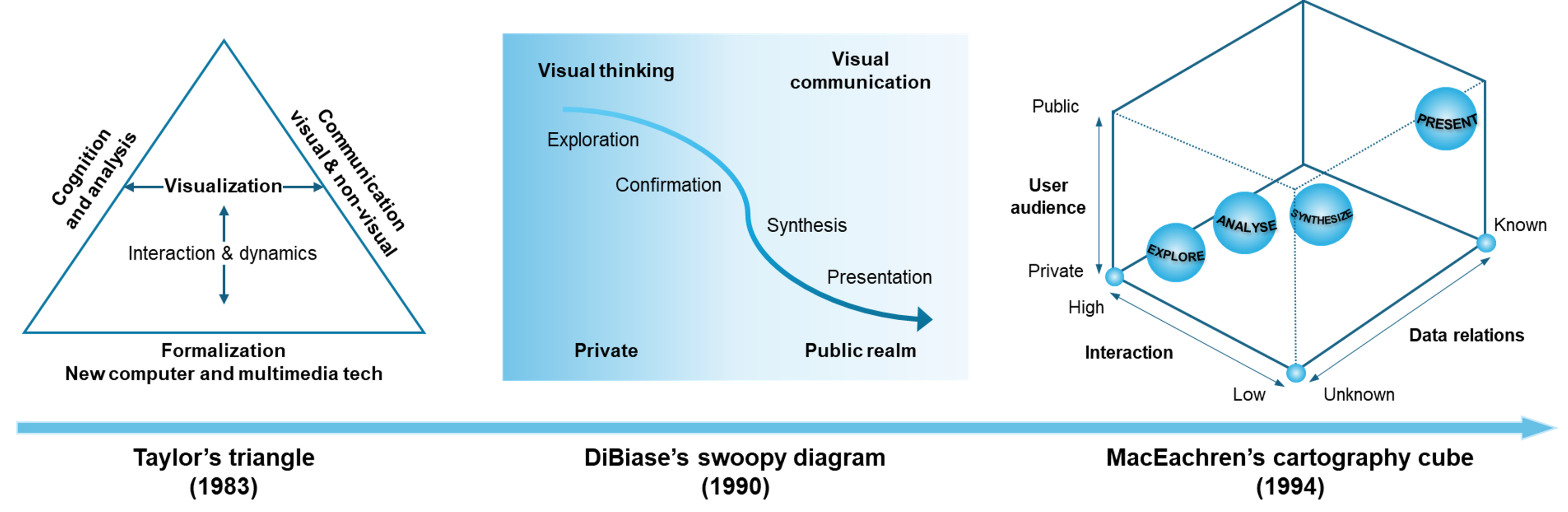
Figure 1: Three classical geovisulization models
Taylor’s model shows the balance between four key elements: cognition and analysis, communication, and Formalization. These elements are connected through a triangular framework. It highlights the importance of using visualization not just to represent data, but to aid in cognitive processes and communication. Additionally, the model reflects the influence of multimedia technologies and formalization on how geographic data is visualized and interacted with.
DiBiase’s Swoopy Diagram focuses on the process of visual thinking and how visualizations assist in different stages of analysis. The diagram represents the stages from exploration to synthesis, covering how a user moves from discovering data patterns to final presentation. The public and private realms indicate how the visualization can cater to both personal (private) and public audiences, showing how the visual analysis is applied across various contexts.
MacEachren’s Cartography Cube addresses the interaction between user audience, data relations, and interaction. The cube structure emphasizes how data can be represented in terms of its known and unknown relationships, and how interaction level varies depending on the type of data and the audience. The model helps in understanding how to present or explore data with varying degrees of complexity and interactivity.
References
- MacEachren A. M. and Taylor D. (1994), Visualization in Modern Cartography, Elsevier, Great Britain: Pergamon.