The Cartogram of Global Natural Cities
The cartogram is generated based on the geographic distribution of natural cities worldwide, visually representing their sizes and spatial relationships according to specific data metrics, such as population or land area. In this representation, regions with a larger number of natural cities appear enlarged, while those with fewer natural cities are reduced in size. In this article, I will illustrate the cartograms generated based on natural cities. Natural cities are human settlements that emerge organically and objectively from geographic big data analysis, in contrast to conventional cities, which are defined only by population metrics and organized in a top-down manner by governmental policies. Here we offer an interactive map for global natural cities which are recursively derived from the nighttime light image of 2022.
Each natural city is represented by a dot, with its size scaled according to its hierarchical level. For instance, cities with more intense human activity are assigned higher hierarchical levels. Based on this, Figure 1 presents cartograms of natural cities across four geographic scales: global, the United States, Massachusetts, and Middlesex County.
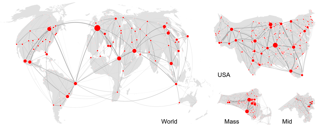
Figure 1: Cartograms generated based on natural cities
So you can see developed countries tend to have a larger number of natural cities, as their formation is based on nighttime light maps, which reflect a country’s level of economic development. Within the United States, we can observe that plains regions, such as the East and West Coasts, are enlarged, while mountainous areas are reduced in size. This is because human activity levels in the plains are significantly higher than in mountainous regions.
References
- Xue A. J., Huang C. and Jiang B. (2024), Measuring global urban complexity from the perspective of living structure, Urban Informatics, 3(1), 1–15.